Wave Medical
Creative Strategy • Branding & visual Identity • Digital Experience
The Challenge
Traditional healthcare often feels cold, transactional, and rushed by the clock. Launching a new Direct Primary Care practice required breaking away from that sterile mold to build immediate trust with patients seeking accessible care across all stages of life.
The Process
Strategic positioning anchored the brand in a simple, reassuring truth: health isn’t linear—it ebbs and flows. That foundational insight guided the naming of Wave Medical and shaped a patient-first brand architecture built around unhurried attentiveness, reframing clinical visits as a continuous, supportive relationship rather than a series of isolated transactions.
The Execution
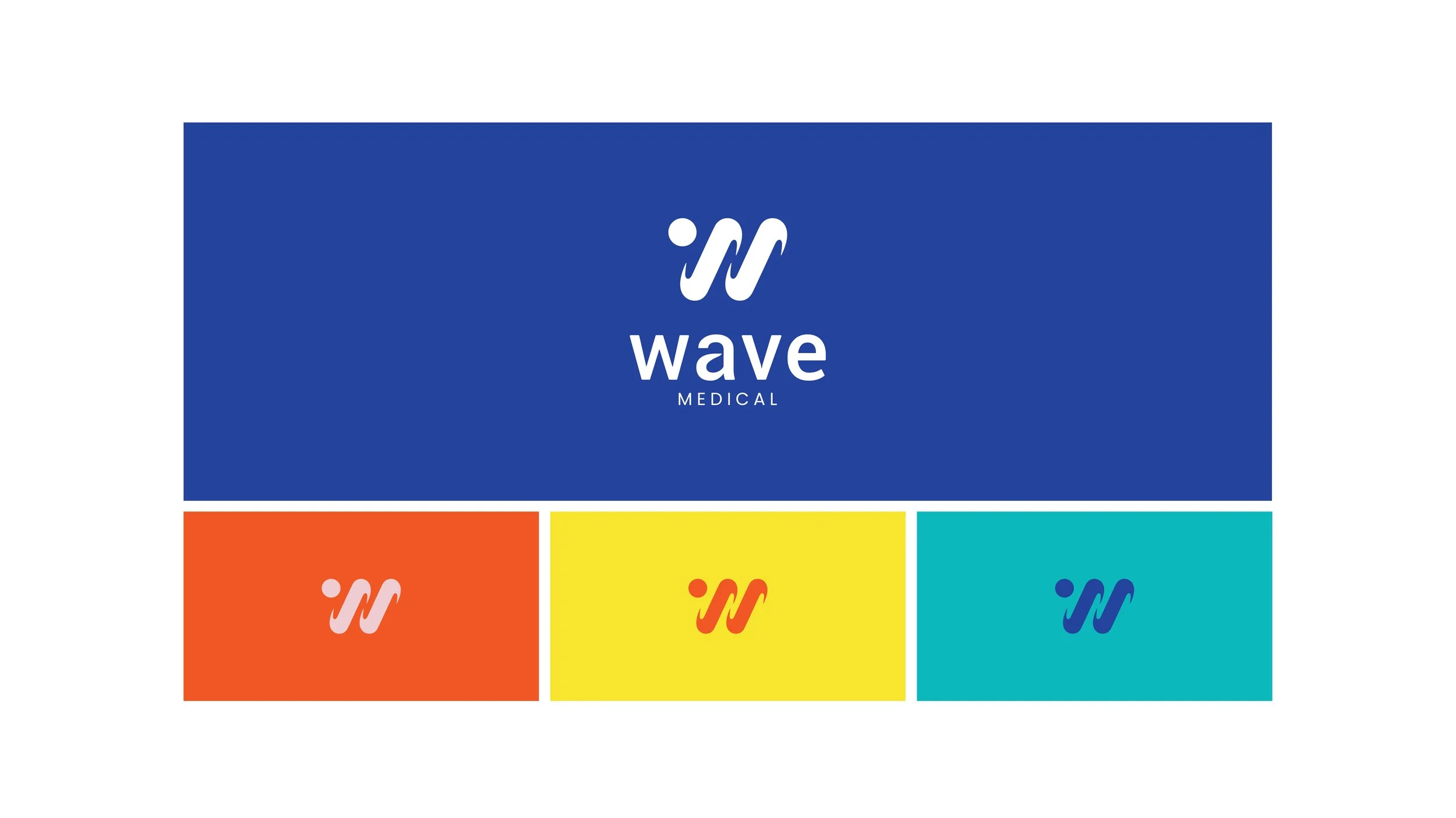
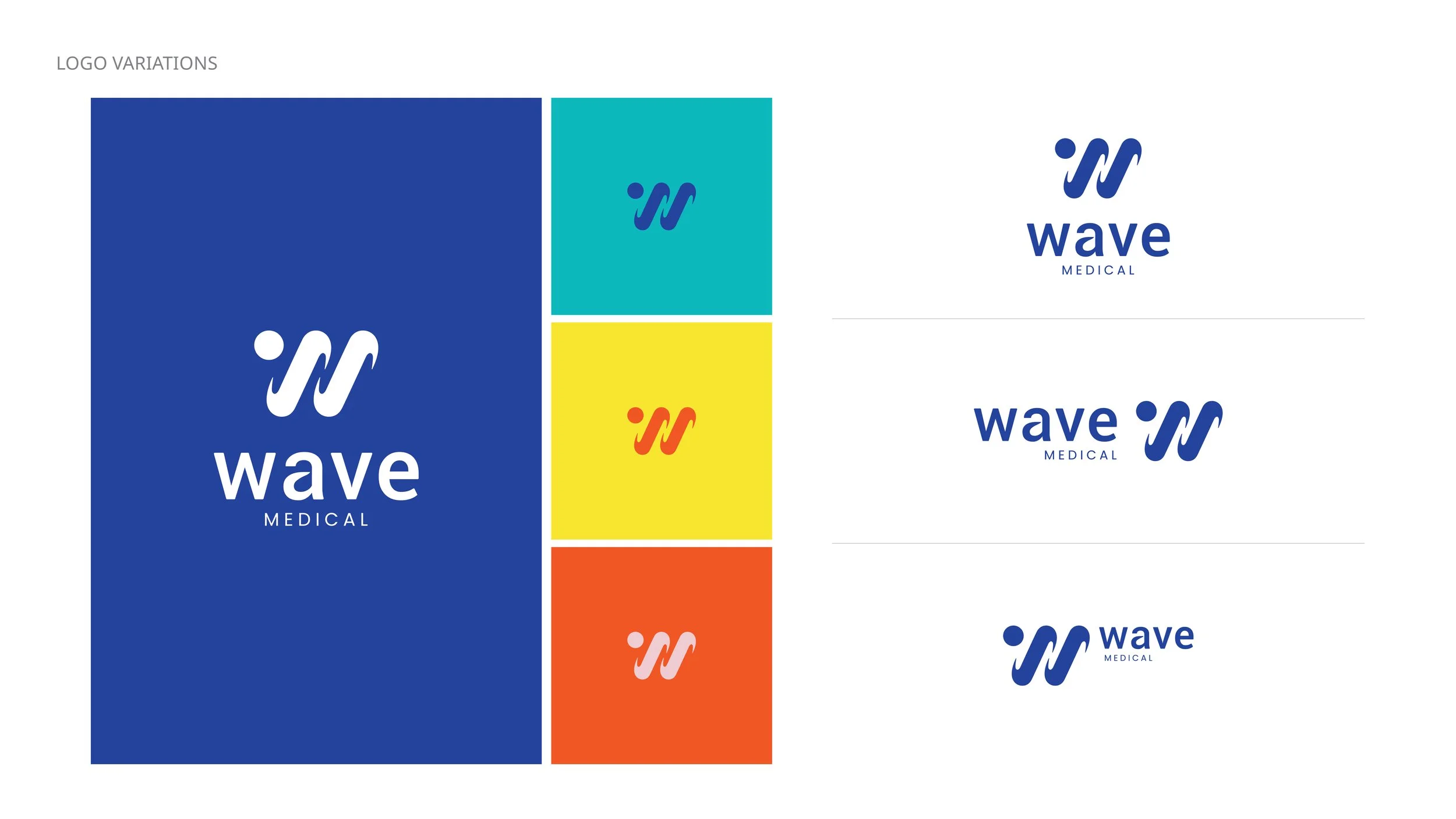
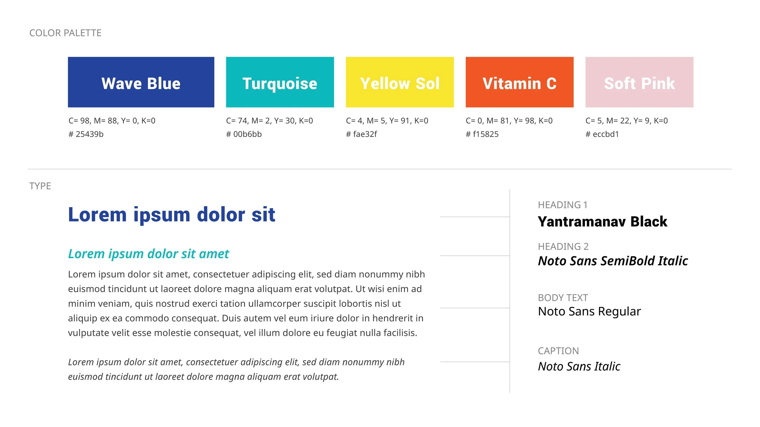
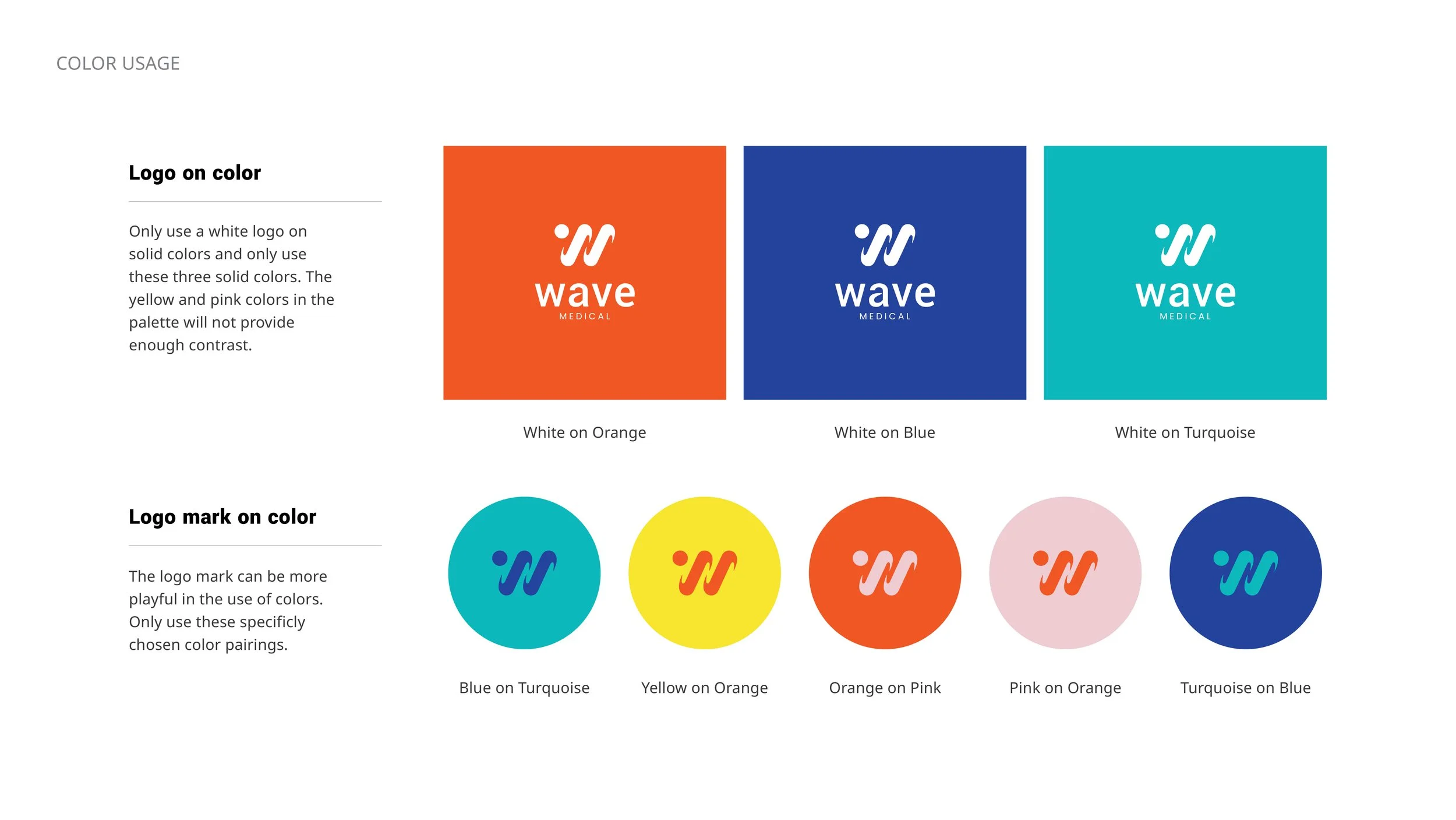
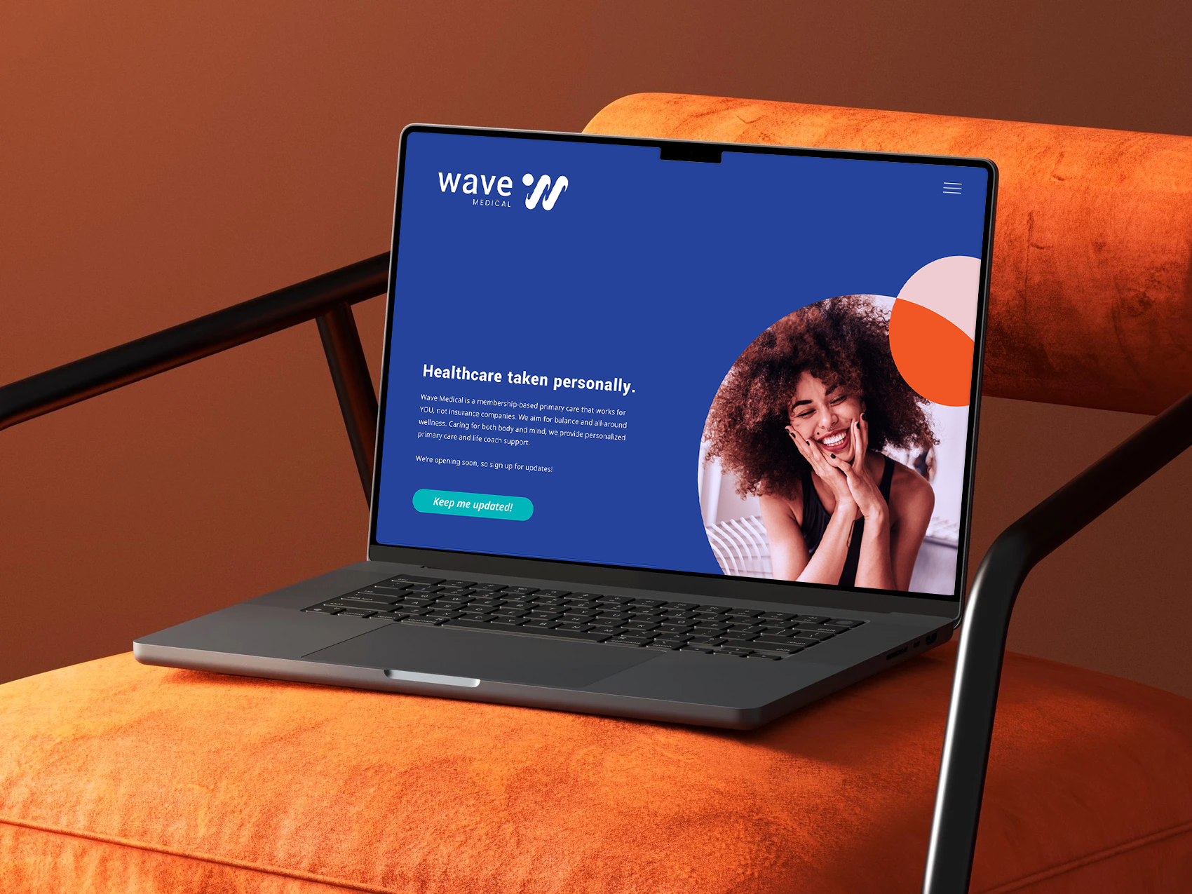
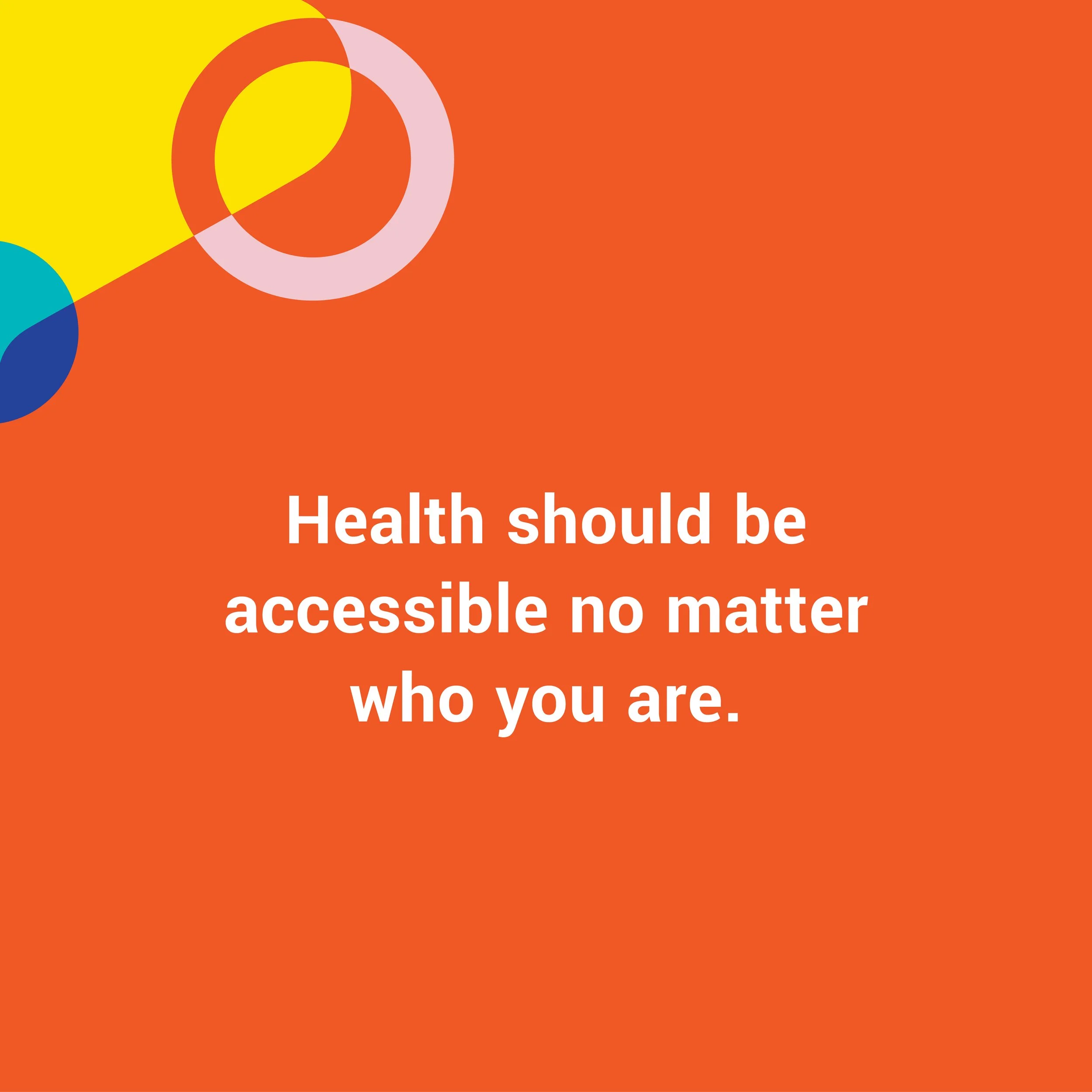
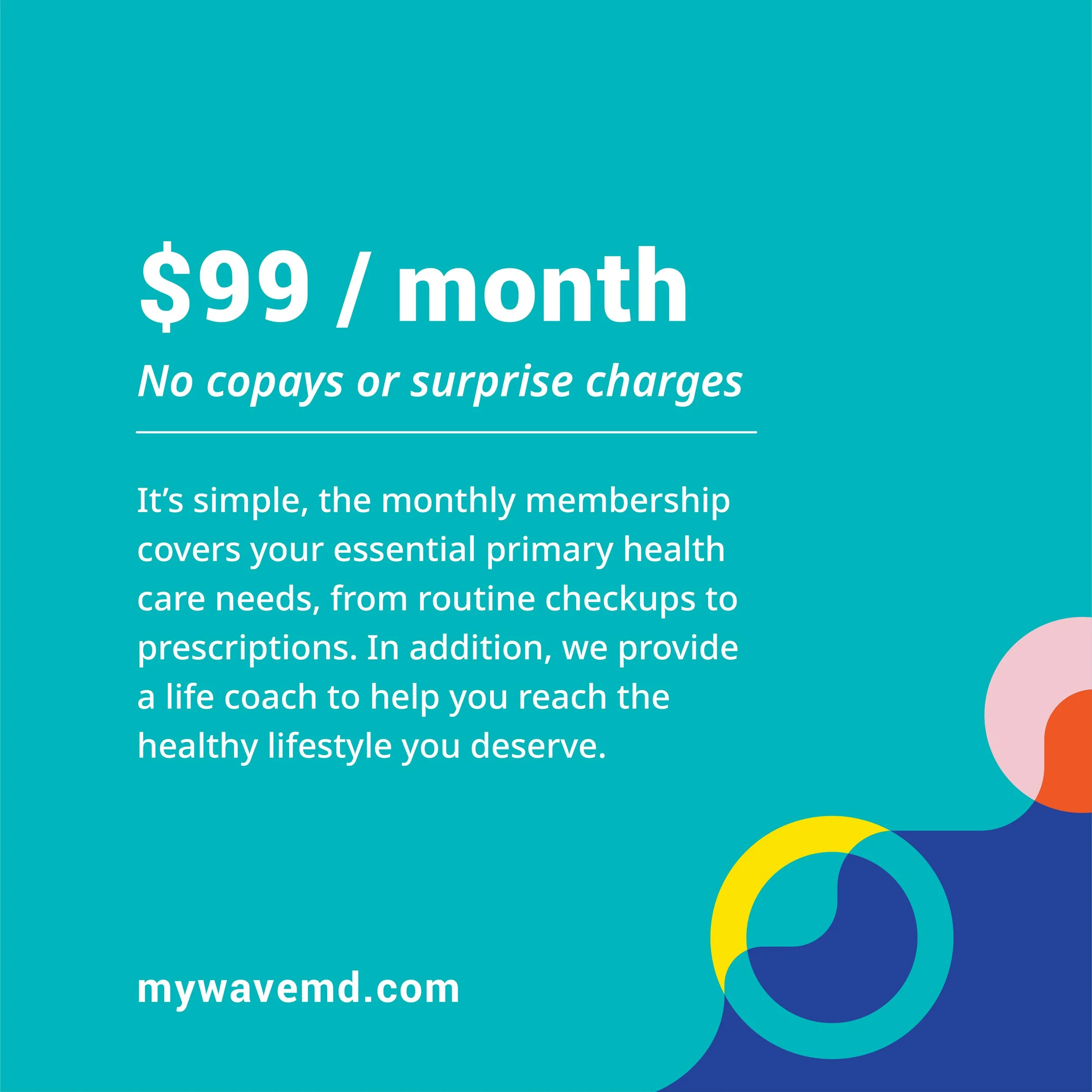
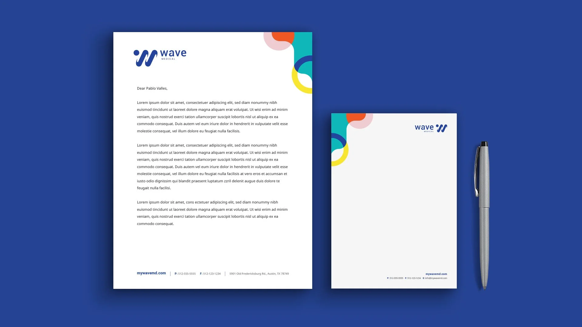
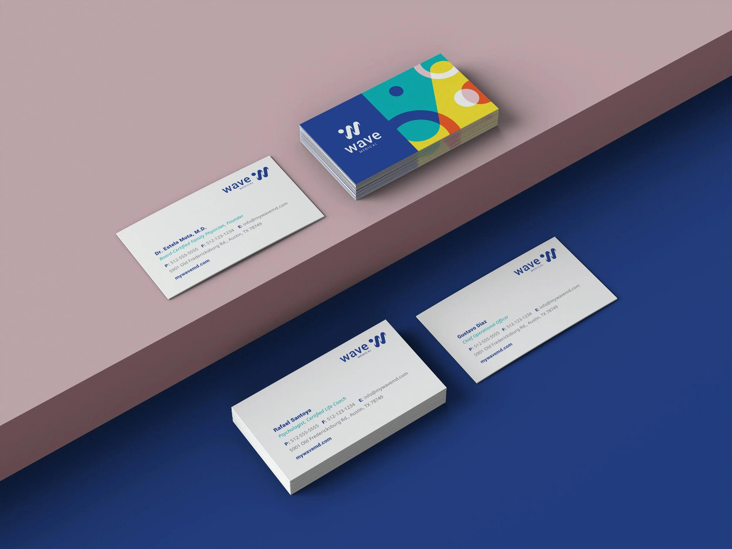
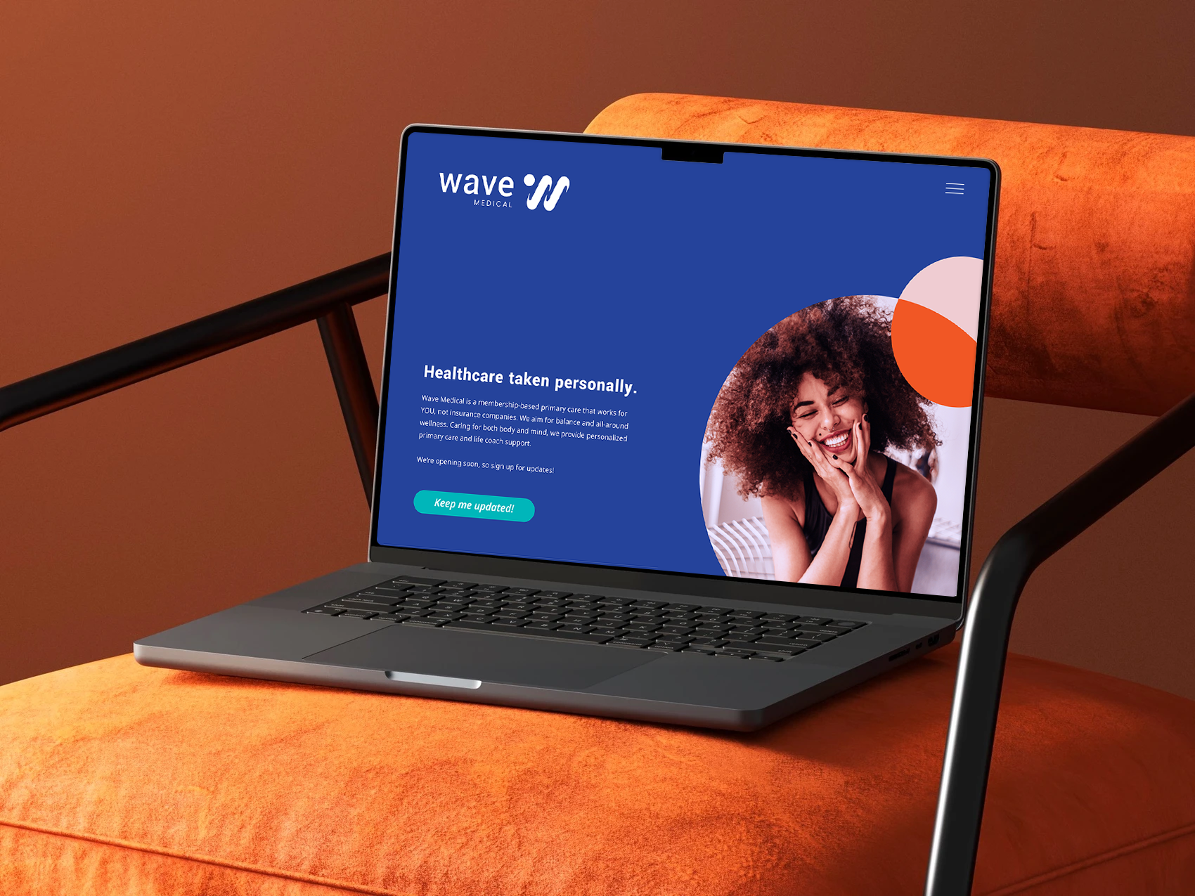
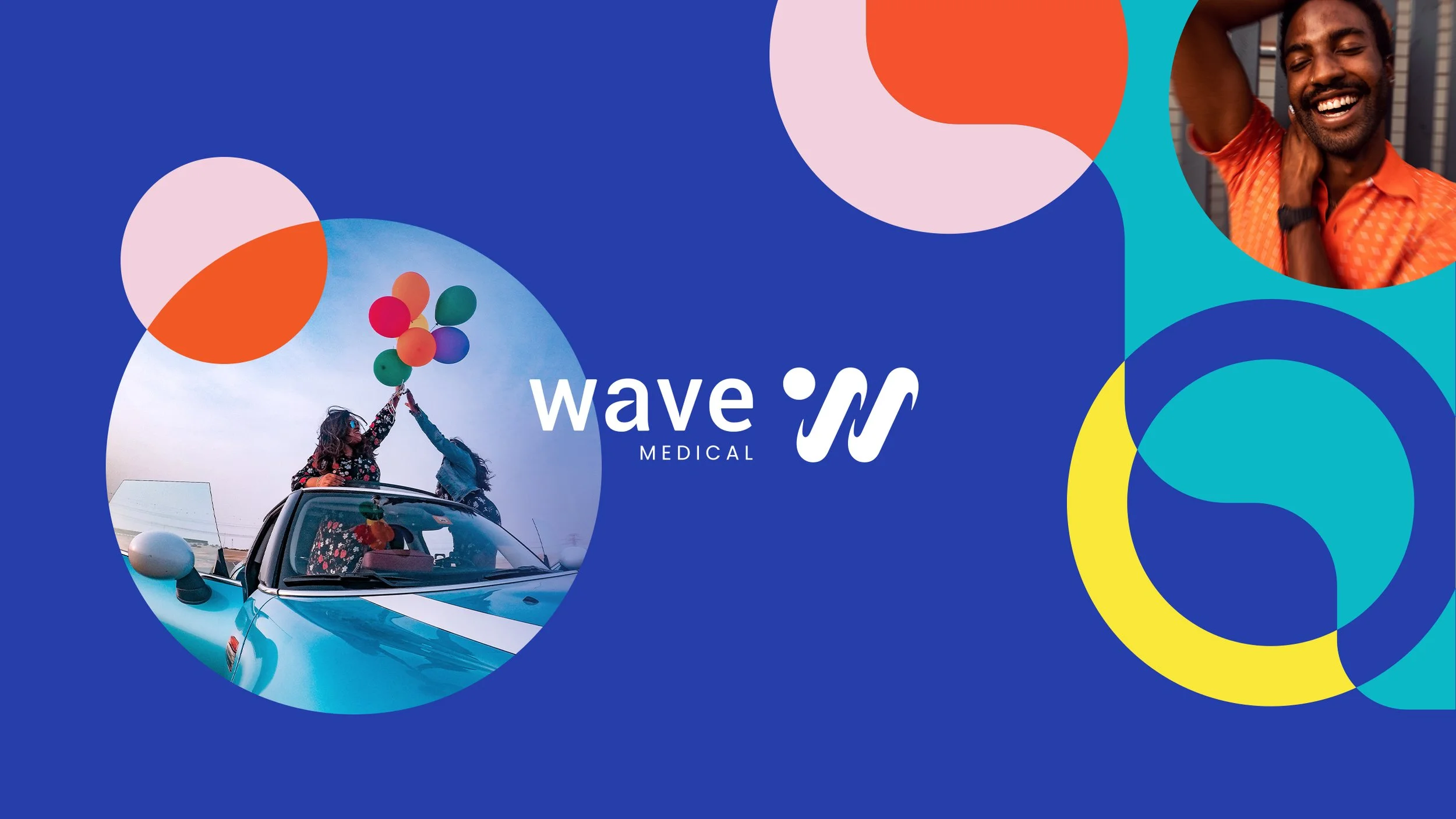
The visual system translates that human warmth into every patient touchpoint. A stylized, lowercase wave logomark pairs with an uplifting, energetic color palette and approachable typography to put visitors at ease. This cohesive identity extends seamlessly across an intuitive web experience, clinical apparel, and patient collateral, reflecting the undivided attention doctors bring to every visit.