Mushroom Revival - Branding & Package Design
Art Direction • Design • Illustration • Production | Agency: unpack’d
The Challenge
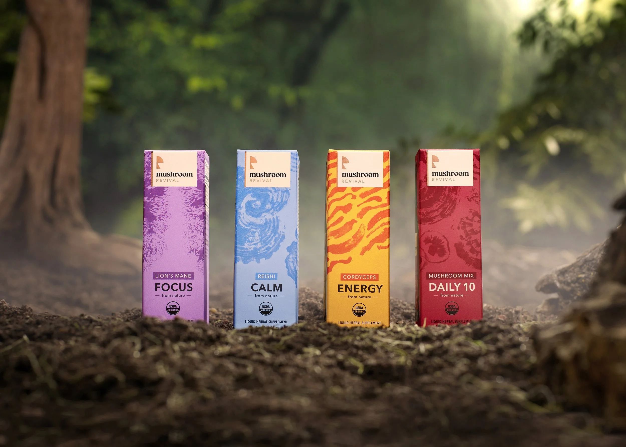
Functional mushrooms often sit at an awkward intersection between sterile, clinical supplements and loud psychedelic clichés. To position Mushroom Revival as an accessible category leader, the brand needed an identity that could demystify mycology for everyday consumers while conveying uncompromised quality.
The Process
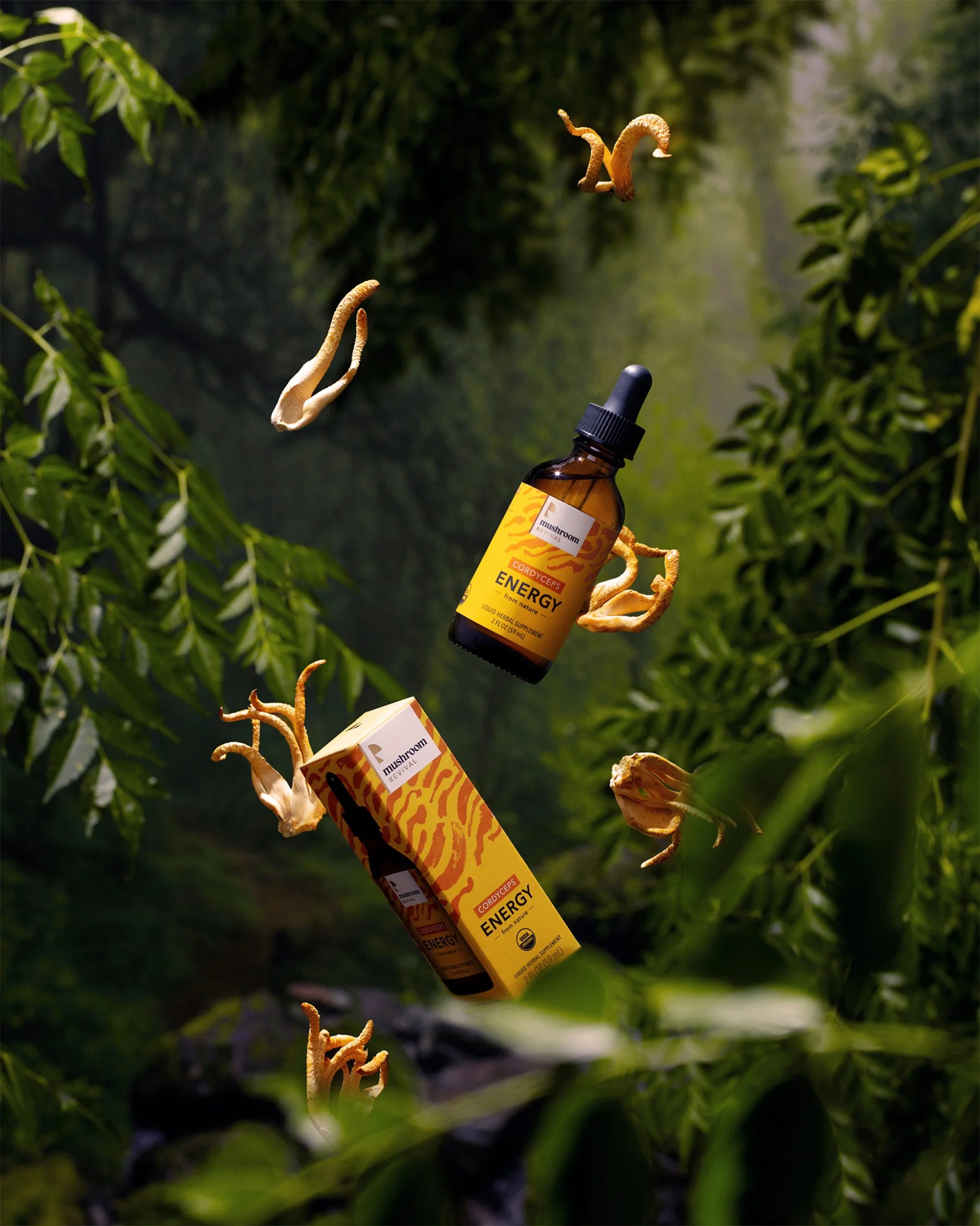
Visual exploration centered on dismantling category intimidation through human warmth and functional clarity. Rather than relying on expected botanical illustrations or counterculture tropes, the art direction focused on abstract visual cues, tactile materiality, and vibrant color blocking to make targeted health benefits intuitive at a glance.
The Execution
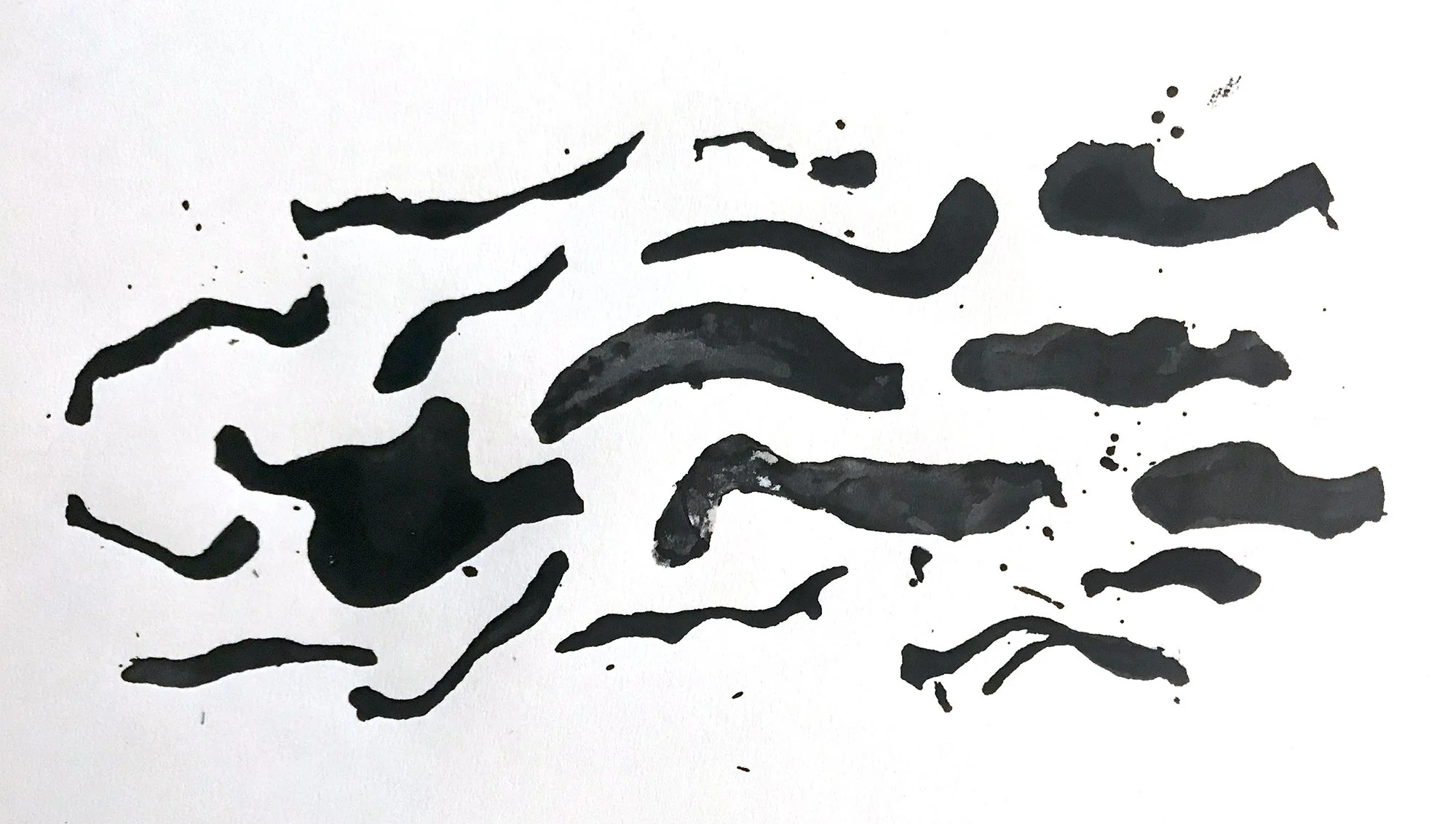
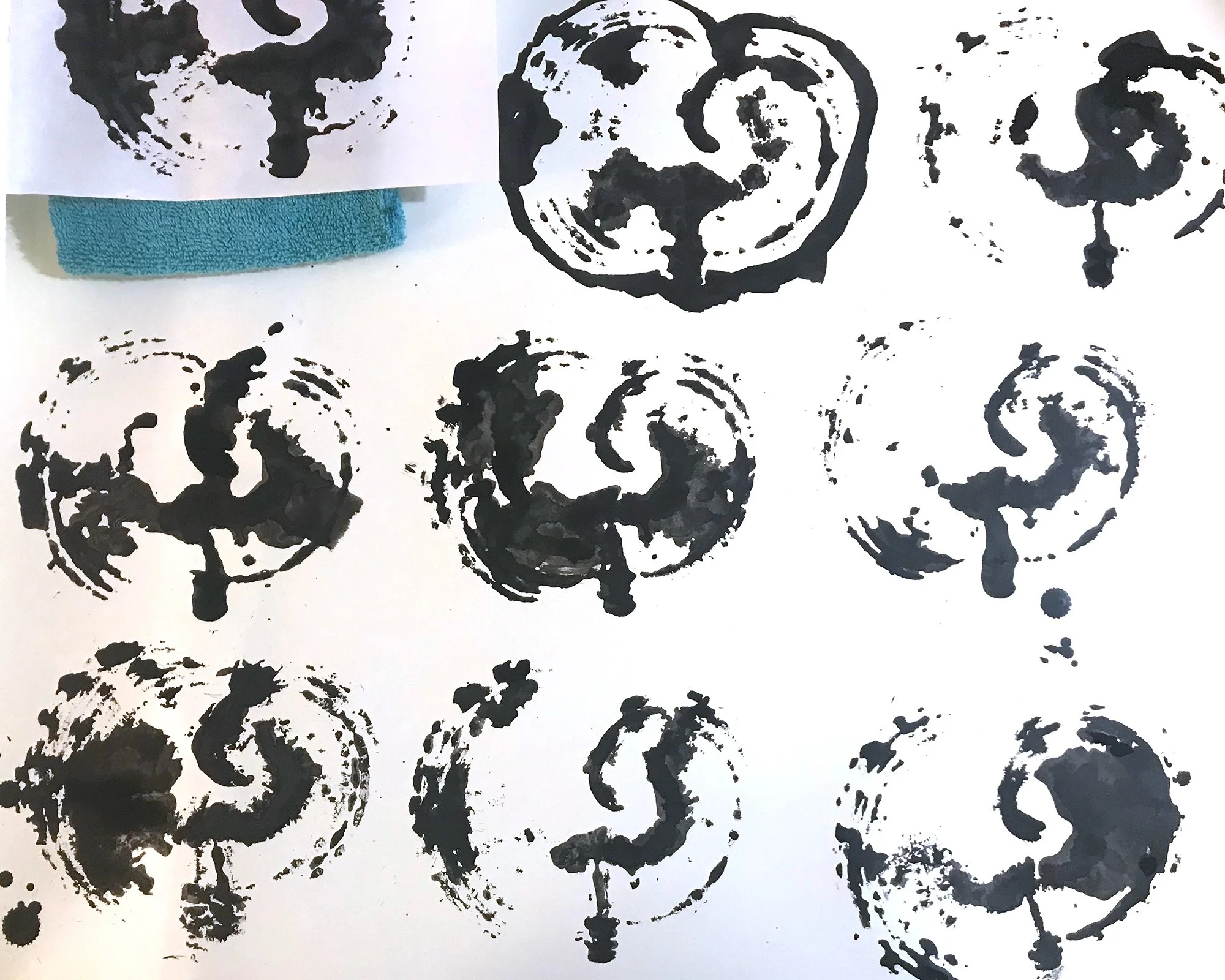
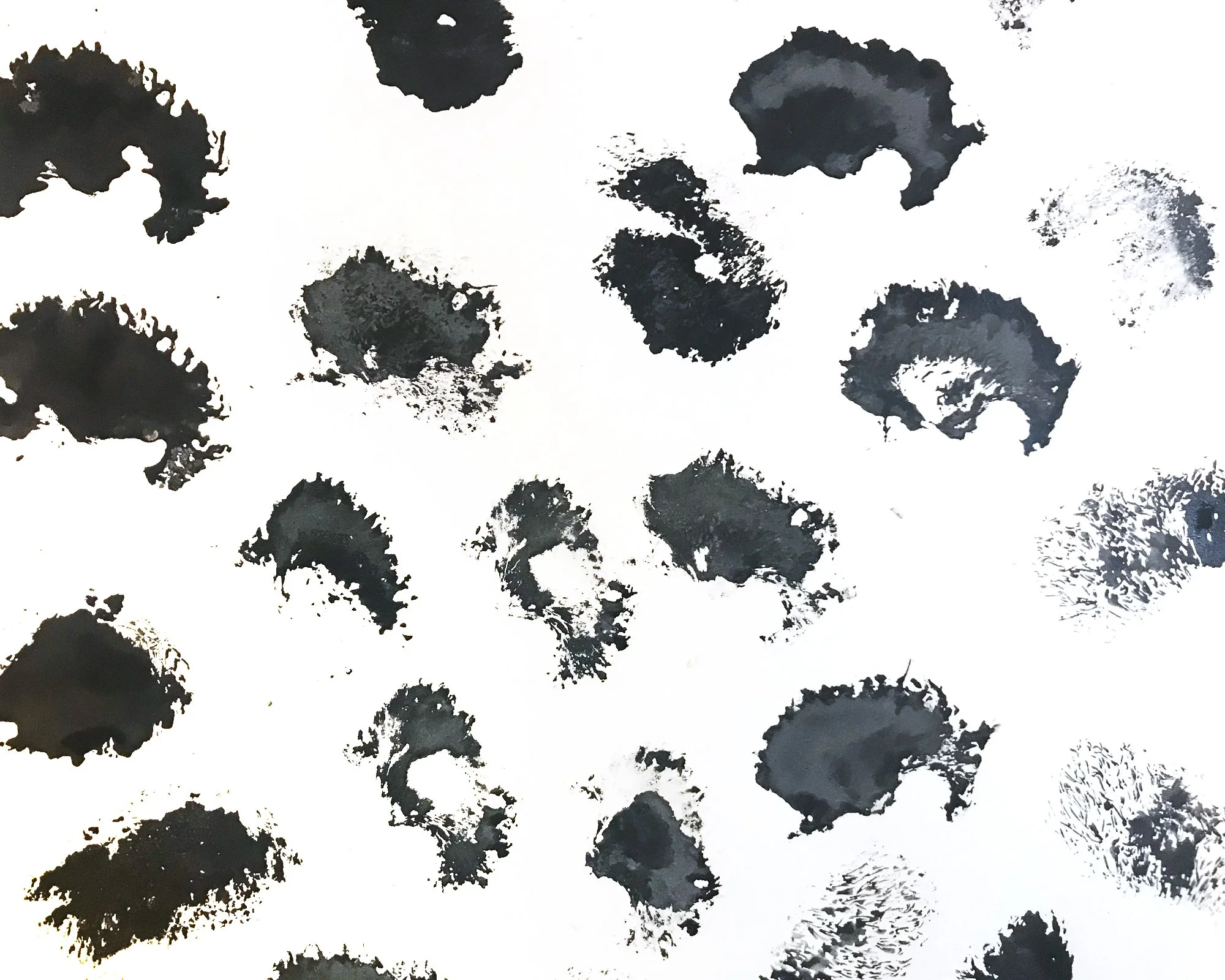
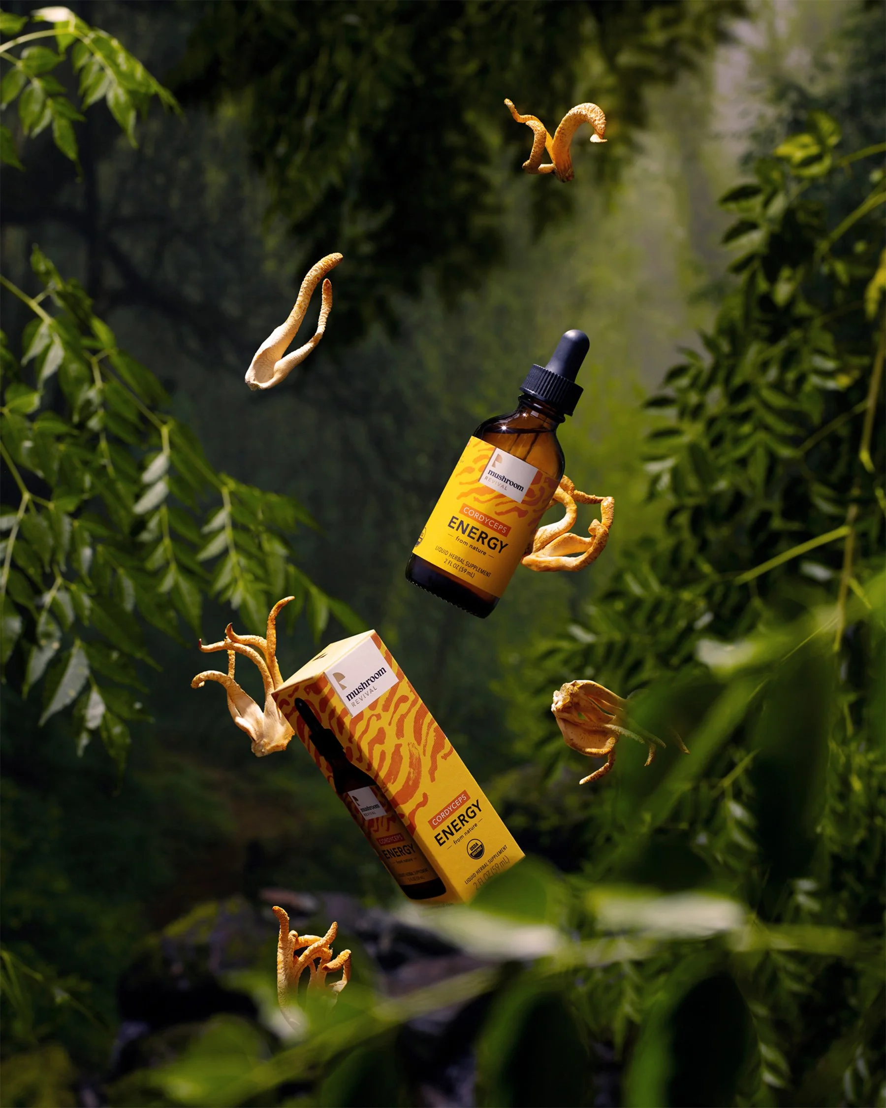
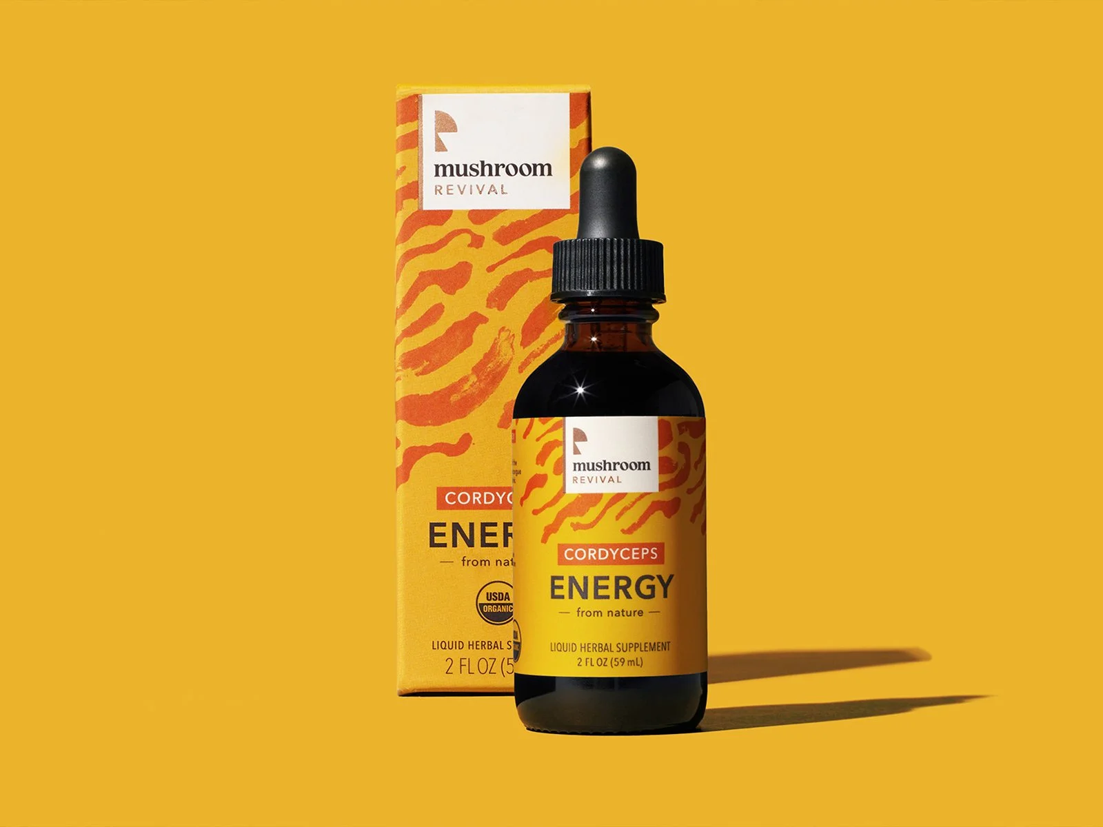
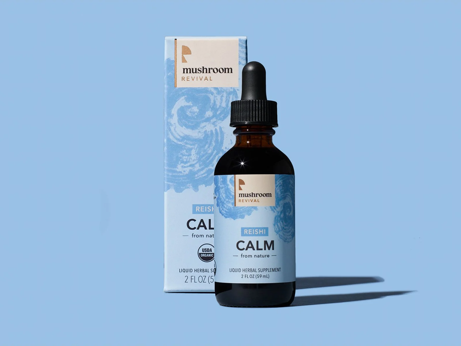
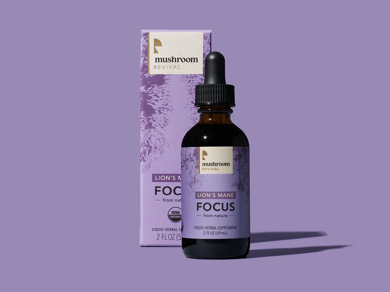
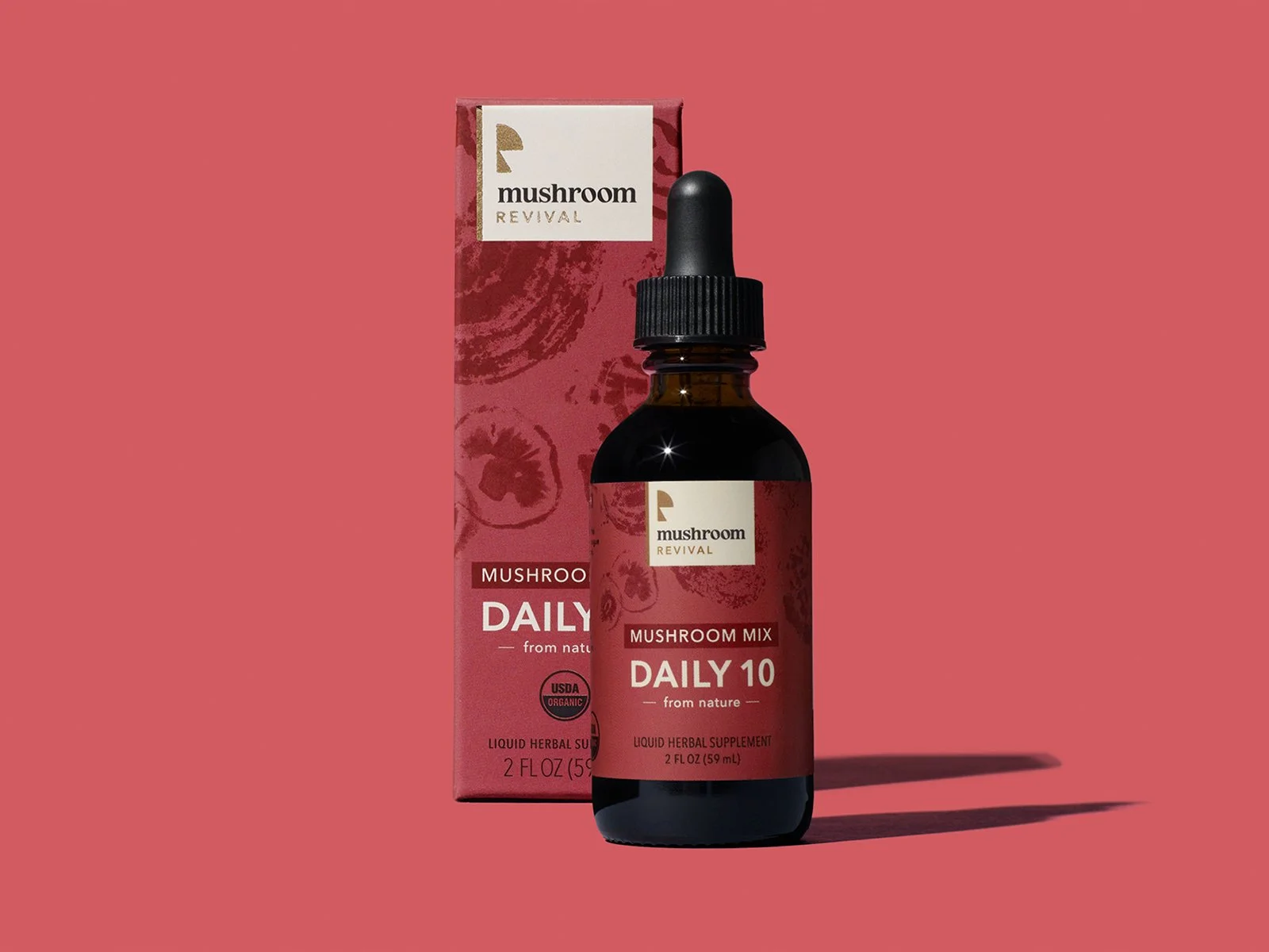
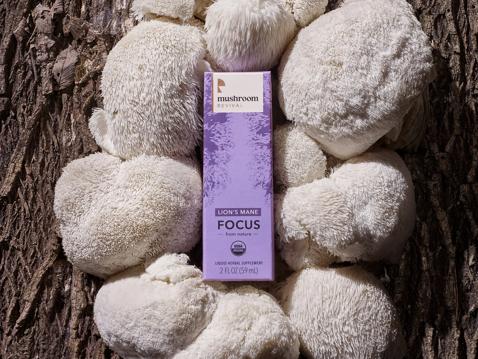
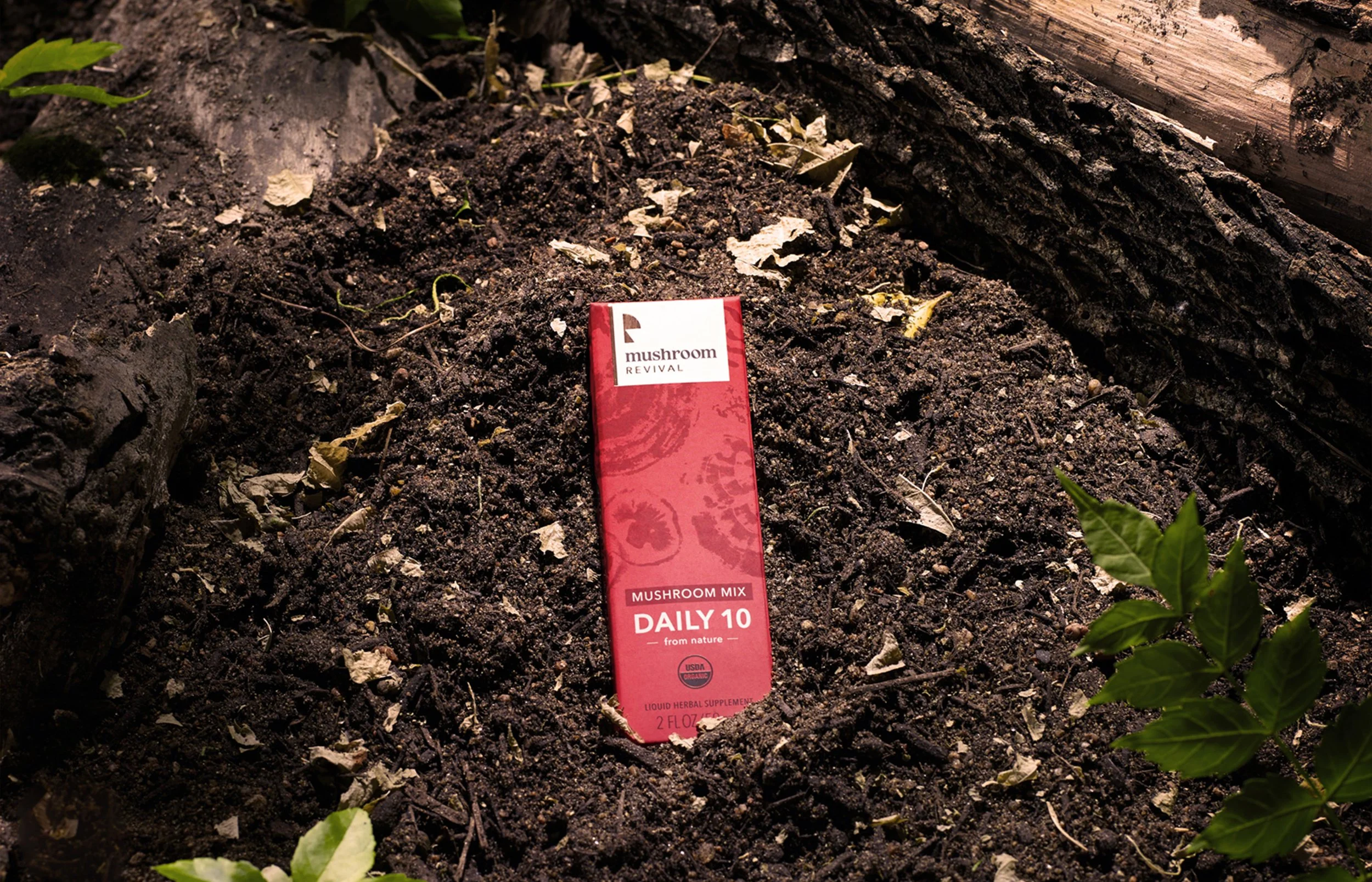
Vibrant floods of color establish an inviting, human presence on the shelf, paired with clean, species-specific ink blots that clearly signal each product's functional benefit. Soft-touch substrates and precision foil stamping elevate the tactile experience, grounding the approachable aesthetic in unmistakable craftsmanship and consumer trust.
Behind the Scenes
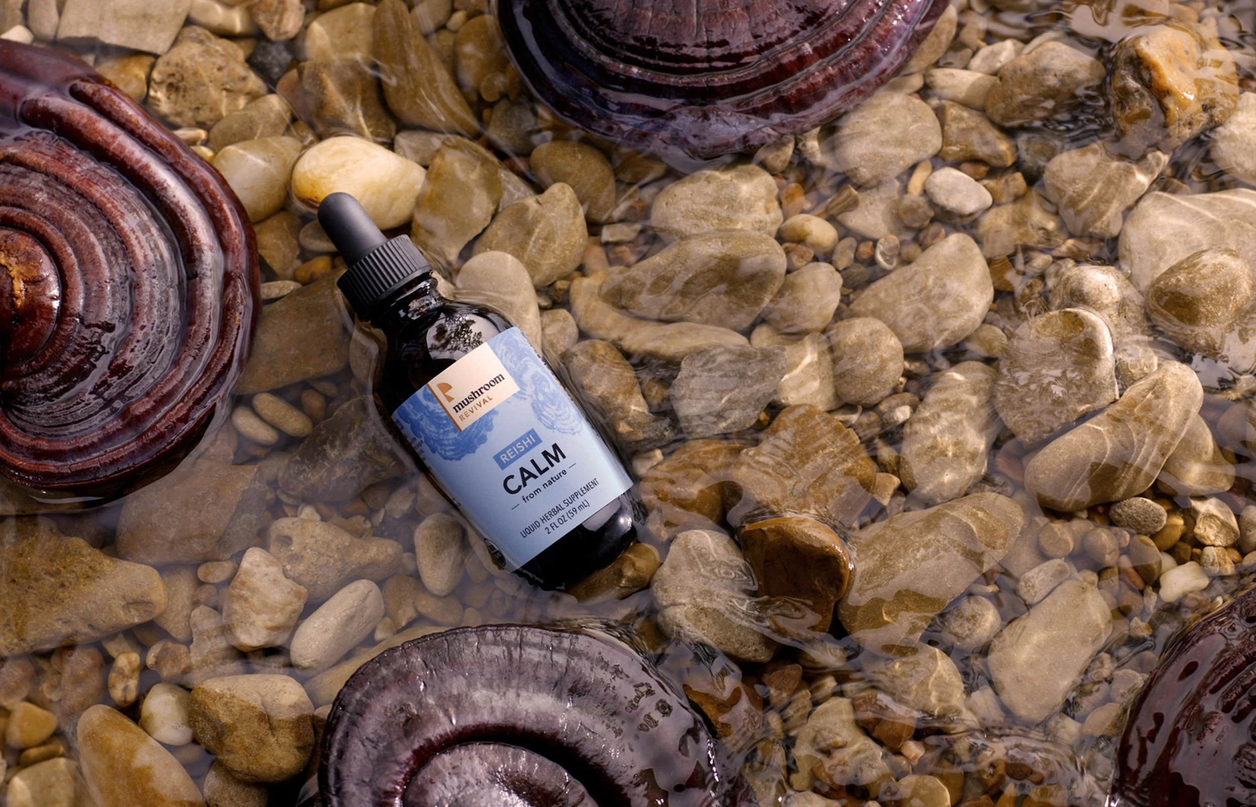
Sometimes you’ve got to get your hands dirty. Each illustration began with real mushroom samples dipped in ink and stamped on paper. The ink prints captured the unique characteristics that distinguish Cordyceps from Reishi from Lion’s Mane, and so on.