Escape Artists
Art Direction • Design • PRODUCTION | Agency: unpack’d
The Challenge
Despite leading the Colorado cannabis topicals market, Escape Artists suffered from a disconnect between product efficacy and shelf presence. As state-by-state legalization accelerated, the brand needed to defend its market share against emerging competitors and appeal to wellness-minded newcomers who were put off by overt stoner clichés and intimidated by unclear dosing.
The Process
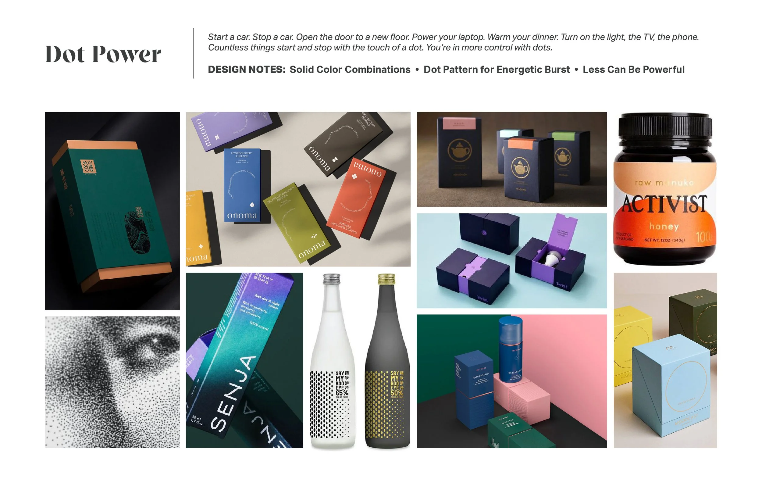
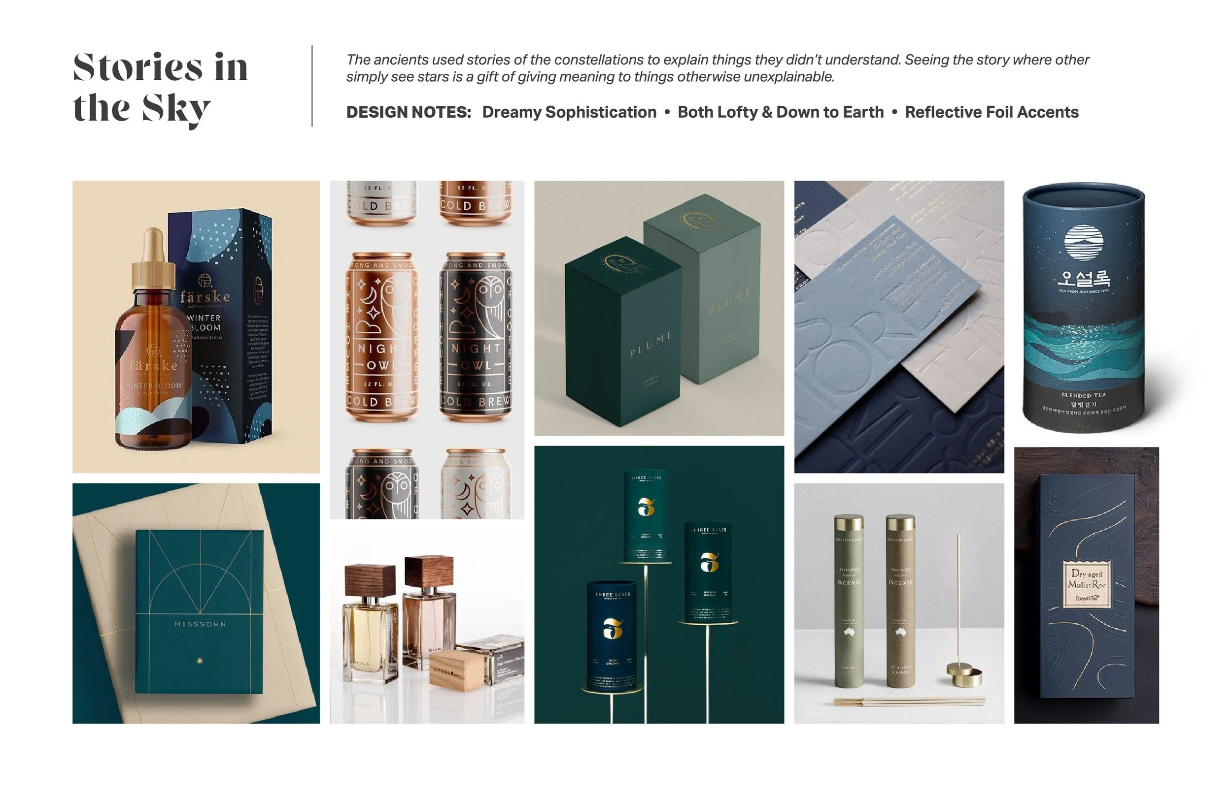
Early visual direction balanced two distinct territories: high-contrast, color-blocked minimalism paired with stippled dot patterns to convey energy and relief, alongside a quieter, tactile aesthetic rooted in grounded earthiness and dreamlike sophistication. Across both paths, the focus centered on restraint—letting bold solid color pairings, organic textures, and reflective metallic accents carry the brand’s authority rather than relying on decorative clutter.
The Execution
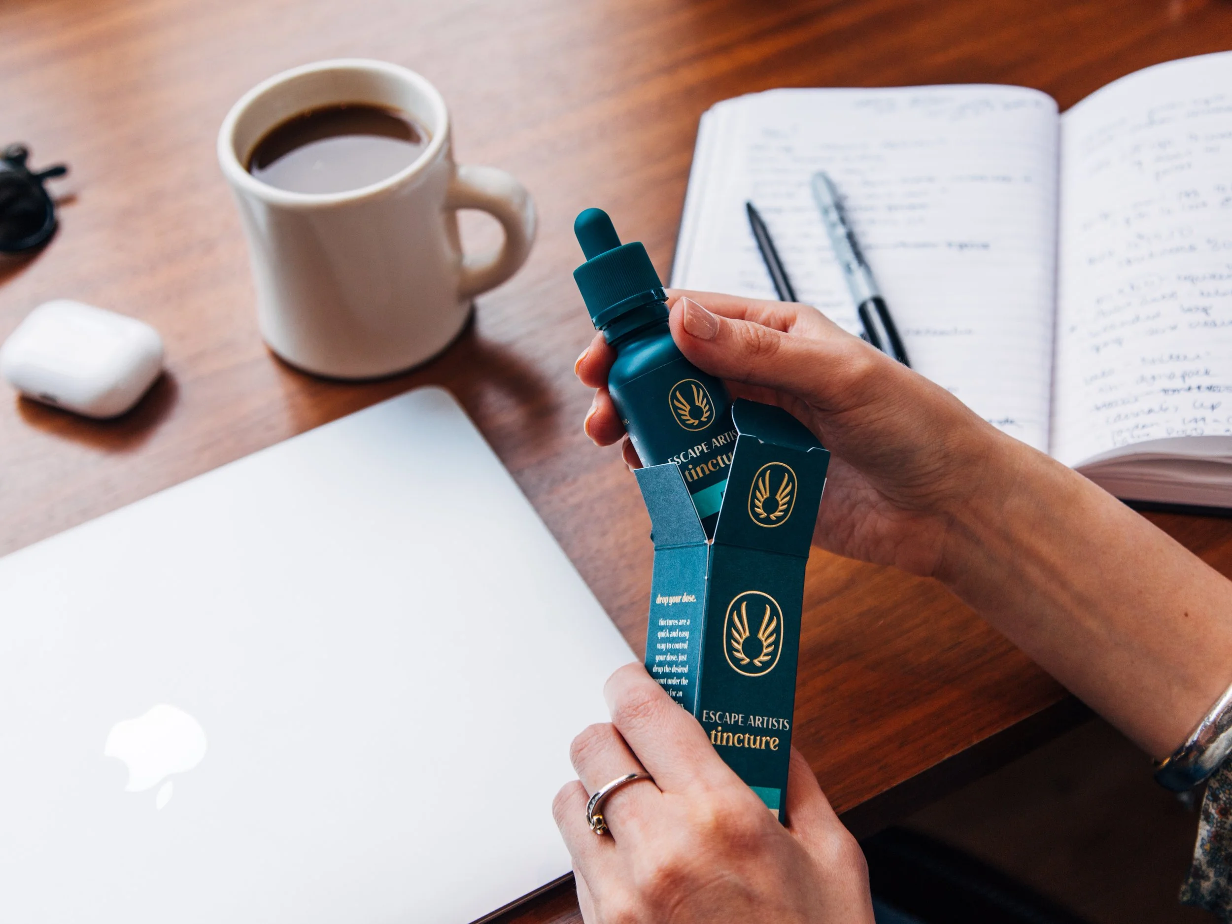
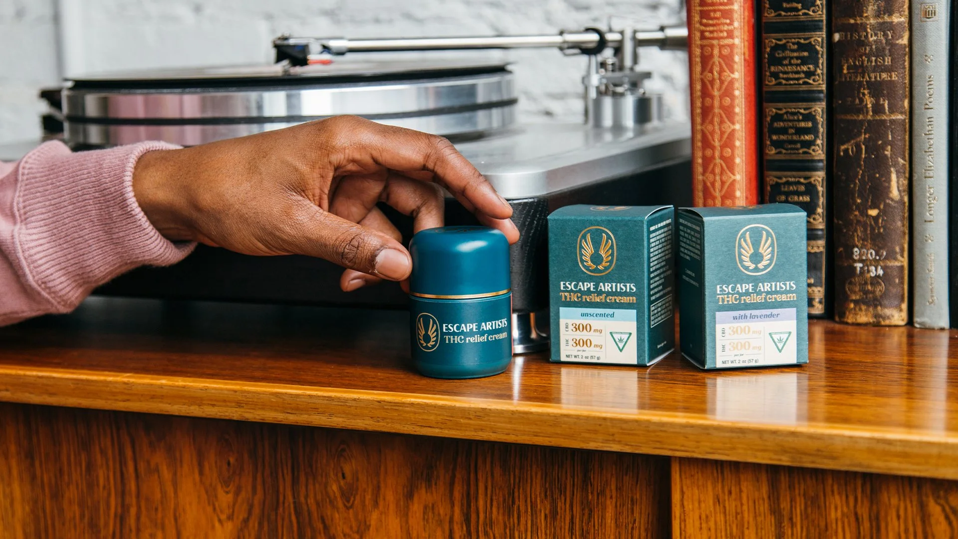
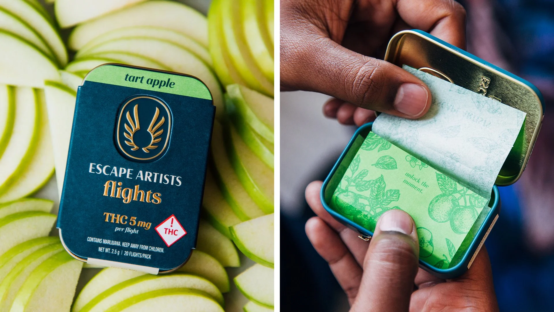
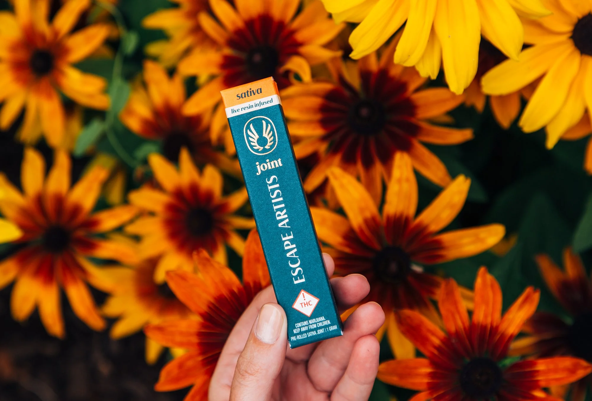
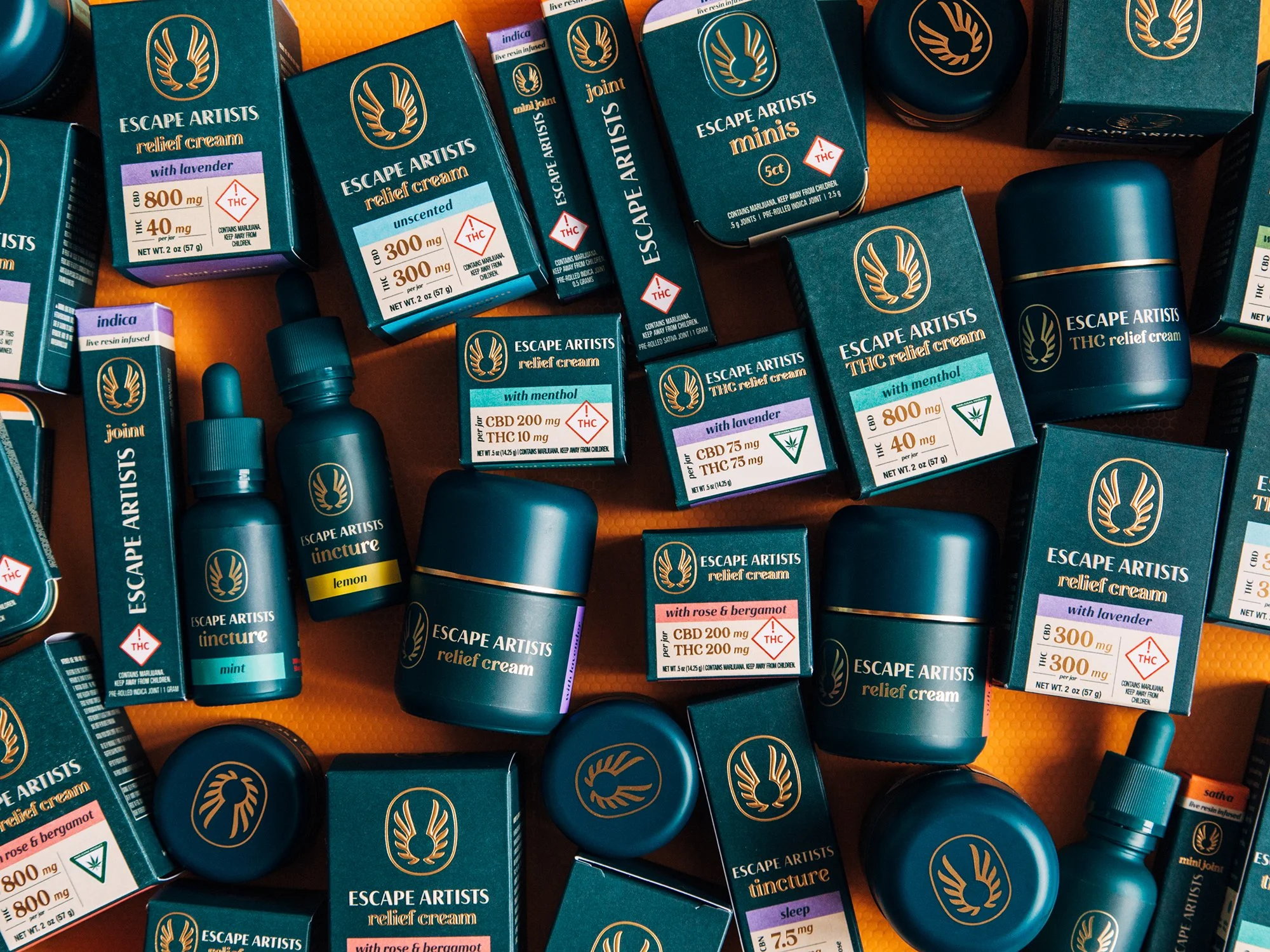
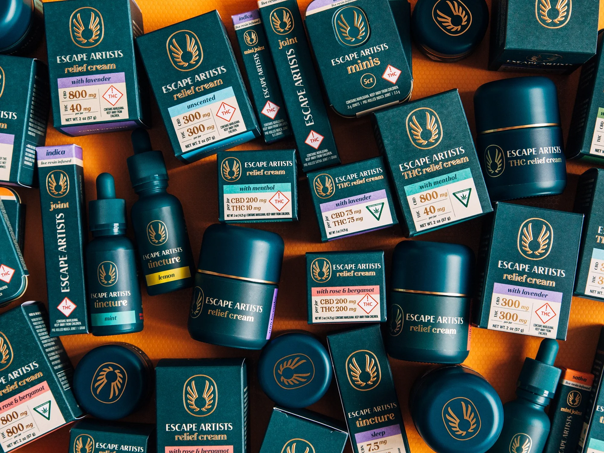
To normalize cannabis as an everyday self-care ritual, the redesign replaced loud category tropes with quiet, editorial restraint. A signature teal anchored shelf recognition across dispensary displays, while clear typographic hierarchy made THC and CBD ratios effortless to read. Foil stamping, tactile substrates, and a custom keyhole monogram elevated clinical topicals into vanity-worthy staples.